The 21st century is a world of packaging. People are no longer satisfied with a simple material life of merely having enough food and clothing. Instead, they focus on quality of life and pursue spiritual enjoyment. For modern consumers, the demand for commodity value lies not only in the utility of products, but also in the pursuit and realization of aesthetic value — and this focus naturally falls on the imballaggio del prodotto progetto of every item, with the most intuitive visual element being the application of color in packaging.
The color aesthetics of commodity packaging has always been essential reference material for packaging designers, as packaging color directly shapes how consumers perceive a brand and its products. In the competitive packaging industry, mastering color application is key to standing out in the market and driving sales.
The Influence of Color on People: Insights for Packaging Designers
Scenario is the intuitive visual expression of color inproduct design del packaging, and the primary prerequisite for the aesthetic value of high-end scatole di imballaggio. For packaging designers, aligning packaging color with the right scenario is essential to creating impactful and memorable packaging.
All beauty is inseparable from a specific scenario — and this applies equally to design del packaging. For instance, a young woman in a cheongsam walking gracefully along a willow-lined boulevard, holding a gift bag from her lover. The exquisite gift packaging design and soft, gentle colors blend perfectly with the setting, embodying the elegance and tranquility of oriental women. By contrast, seeing a woman in a cheongsam running on a sports track would feel utterly out of place.
Similarly, red itself is a beautiful color, yet it would be inappropriate if painted on the walls of a psychiatric hospital. Clashing with the hospital environment, red would fail to aid treatment; instead, it would overstimulate patients’ nerves — a perfect example of mismatched color and scenario. This lesson is vital for packaging designers: packaging color must align with the product’s use case and the consumer’s emotional expectations.
The Practical Experience Color Brings to Product Packaging Design
The catering industry also attaches great importance to color arrangement in store decoration, ensuring color aesthetics align with the venue’s overall ambiance and scenario — a principle that also applies to food packaging design. Surveys by economic authorities reveal that when people buy food, color appeal comes first, followed by taste — exactly what is described asa feast for the eyes. For food packaging designers, this means that packaging color is the first step in attracting consumers and driving initial interest.
Therefore, proper and reasonable use of color in product packaging design can arouse consumers’ initial purchasing intention, attract more customers, and boost business prosperity. This is true across all industries, from food and beverage to cosmetics and electronics — packaging color is a universal language that connects brands with consumers.
It is evident that color application in commodity packaging must follow certain principles and match its corresponding scenario. To give full play to the aesthetic value of color, we integrate packaging color design with thematic scenario construction throughout the product packaging design process.
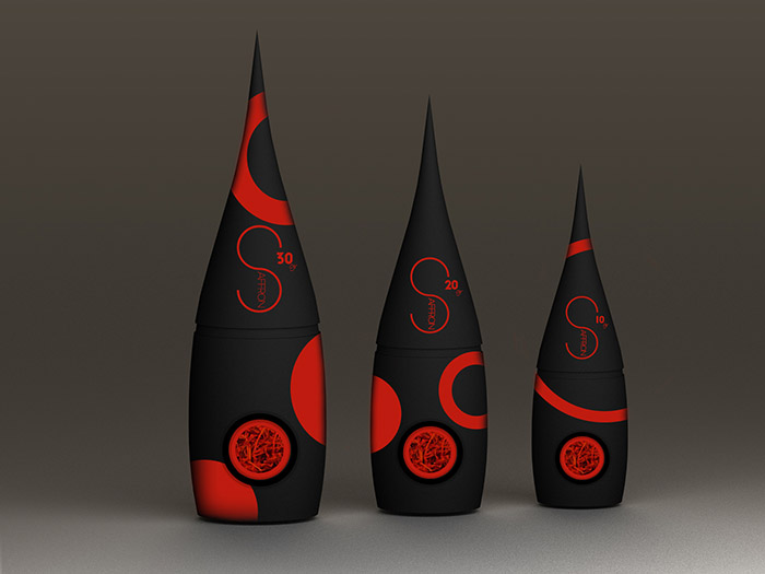
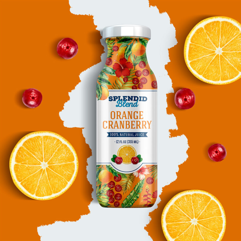
People rely heavily on beverages during hot summer days. Advertisers of well-known beverage brands skillfully leverage the inherent temperament of colors to present mesmerizing scenes of the ocean and sky to audiences — a strategy that beverage packaging designers can adopt to great effect. Take Sprite’s design del packaging as an example: the blue of sky and sea, paired with green-toned bottles. This series of cool color tones delivers a refreshing sense of coolness amid the scorching summer heat, making the beverage packaging not only visually appealing but also emotionally resonant.
The Importance of Color in Packaging: Beyond Aesthetics
Without color, life would become pale and monotonous; without color, commodities would appear dull and mediocre. Rich and varied colors beautify our lives and enrich our inner world — and this is especially true for imballaggio del prodotto.
In this sense, all kinds of product scatole di imballaggio — especially those with charming packaging color designs — not only fulfill product practical functions, but also enter every household carrying emotional warmth. For packaging designers and brands alike, understanding the power of color is key to creating packaging that stands out, resonates with consumers, and drives long-term success.
Let us bear this in mind: properly applied packaging colors are a heartfelt blessing in visual form — and a powerful tool for growing your brand in the competitive packaging industry.